5 Key Takeaways from UX+ Conference 2020 Every Creative Must Know

Several user experiences (UX) conferences have been popping up worldwide over the last decade. This is understandable as UX design is vital in providing positive experiences that keep users loyal to the product or brand.
Just last year, the biggest conference in Asia took place here in Manila, Philippines: the UX+ Conference which is the brainchild of the team behind Graphika Manila and 8020.
The UX+ Conference featured speakers from some of the biggest tech companies today, such as Google, Twitter, Dropbox, and more, showcasing various UX approaches.
Here are five key takeaways to ponder on as a creative this year.
1. Avoid anxiety, deliver delight
When interacting with an interface, delight in UX positively responds to a pleasing event. This response is critical in UX, as we become more susceptible to influence when our emotions are heightened.
One of the speakers, JP De Guzman, shared that to deliver delight to our customers, we have to be aware of their anxieties. These are when users feel uncomfortable using your website or simply put their common pain points.
By being aware of our users’ anxieties, we can take it as an opportunity to deliver delight.
Some of the examples are the following:
- Using loading animation when waiting for data to be fetched
- Using alert messages as an acknowledgment that an event/action is done
- Using progress bars for multi-step forms to visually indicate the form’s status
- Ensuring that links are visually differentiated from regular text elements
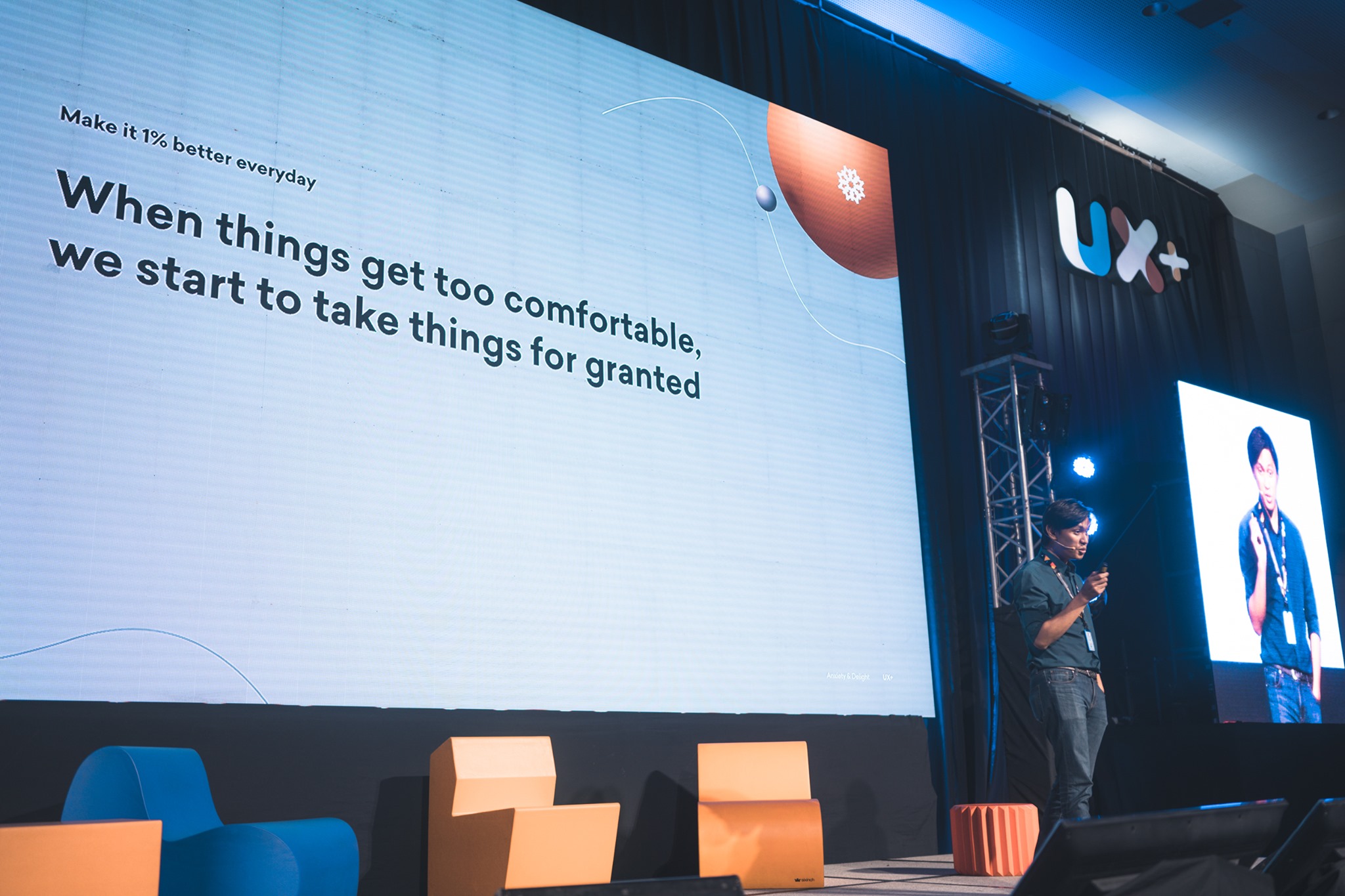
JP De Guzman - Photo from UX+
JP also pointed out delight is not just about those pretty illustrations and animations. More than anything, consumers care about ease of use.
Since delight is also about performance and usability, users will most likely leave your website once it becomes difficult to use.
Remember that they spend a lot of their time browsing the web, so they expect your website to work the same way as other websites.
2. Embrace complexity and be aware of biases
The Occam’s Razor principle states that the simplest solution tends to be the correct one.
Minimalists, rejoice! As a web developer and an aspiring web designer, I’ve seen that overcomplicating things—not just in tech but also in life—leads to more problems.
However, the Director of UX for Google, Paulo Malabuyo, gave a different perspective. He argued in his talk that sometimes the best solution is the complex one—when done right.
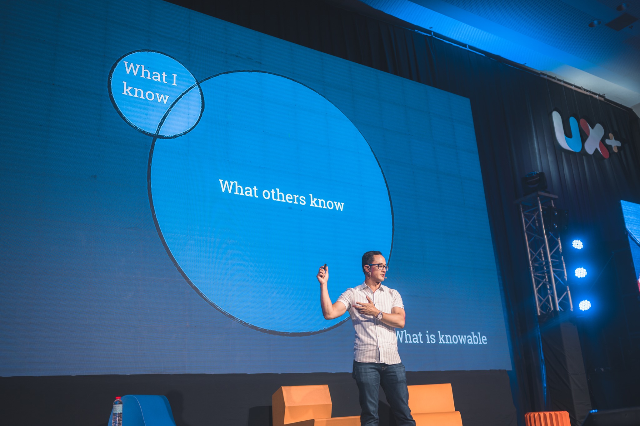
Paolo Malabuyo - Photo from UX+
Paolo—who has previously worked at Microsoft, Netflix, and Zynga (remember Farmville?)—shared the process of how his team at Google embraced complexity and tackled their challenges:
A. Strategic
What should we build, and for whom? This first phase is about foundational user research, competitive evaluation, and UX principles.
B. Tactical
This phase encompasses the building process. This is where interaction, motion, and interface design come in. This includes content strategy as well as prototyping.
C. Evaluative
What’s next? What worked? Conduct usability tests, benchmarking, and data analysis.
Use the right methodologies to do the right things at the right time. It determines all ingredients that will help us avoid project failure—a thing that none of us wants.
“I hate the fetishization of failure. Failure sucks. But when I fail, I learn.”
During his talk, Paolo also stated that we must be aware of cognitive biases. Creatives, especially designers, tend to overlook their confirmation bias. Our tendency to not go for information doesn’t confirm our existing beliefs or ideas.
Instead, we have to see things from other people's points of view. This is essential advice, especially when working in a collaborative environment. Sometimes, we tend to accept our solution over our peers just because their opinion contradicts our point of view, and our idea validates what we already believe. That’s self-verification. That’s confirmation bias.
We can overcome this by accepting the fact that we might be wrong. Be aware of these biases, so we can correct them. Put ourselves in our customer’s shoes. Be emphatic. We are delivering delight to our customers, after all.
3. Go customer-centric
When we understand our customers, the probability of a successful project is pretty high. Forming a solution from their perspective is a solid fail-safe strategy, as it would help us come up with different variations of solutions to share with the people we are creating it for.
Take the example of GrabFood Singapore. Jay Demetillo, the Lead UX for GrabFood Singapore, shared that his team faced challenges when redesigning the food delivery service app because every region has its persona and value.
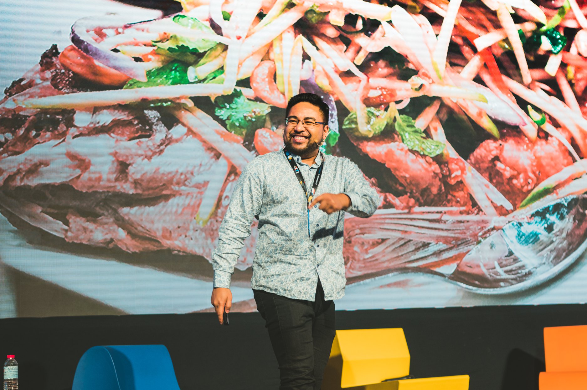
Jay Demetillo - Photo from UX+
To solve this hurdle, his team studied different regions—learning about the customer’s daily habits, even dining with them—and analyzed the pattern.
“Don’t work in silos. Work together as a team. Conflicts happen. Have a discussion, lots of them,” he said, emphasizing the importance of teamwork and discussion and that every idea is still good.
This experience led to this key point:
Focus on the customer’s journey to enjoy a better user experience.
“Treat every user as if they were your grandmother.”
Jay explained that we should shift our thinking about design, stressing that design is not only output but more than just the UI or UX and pretty screens. It’s all about customer-centricity.
Furthermore, to create a more intelligent platform, we need to localize.
“Get out there and enjoy life, find inspiration outside the screen. Learn and fail; not everyone will get your UX.”
He tells us about the value of getting personal with our users to understand them better (which, if you think about it, is not a bad idea at all).
4. Take advantage of user-centered content in digital storytelling
Benjamin Hersh, who previously worked at Medium and currently working as the product designer for Dropbox, mentioned in his talk that content is equally important as digital storytelling design.
Thus, the content’s voice should also be considered in the design process.
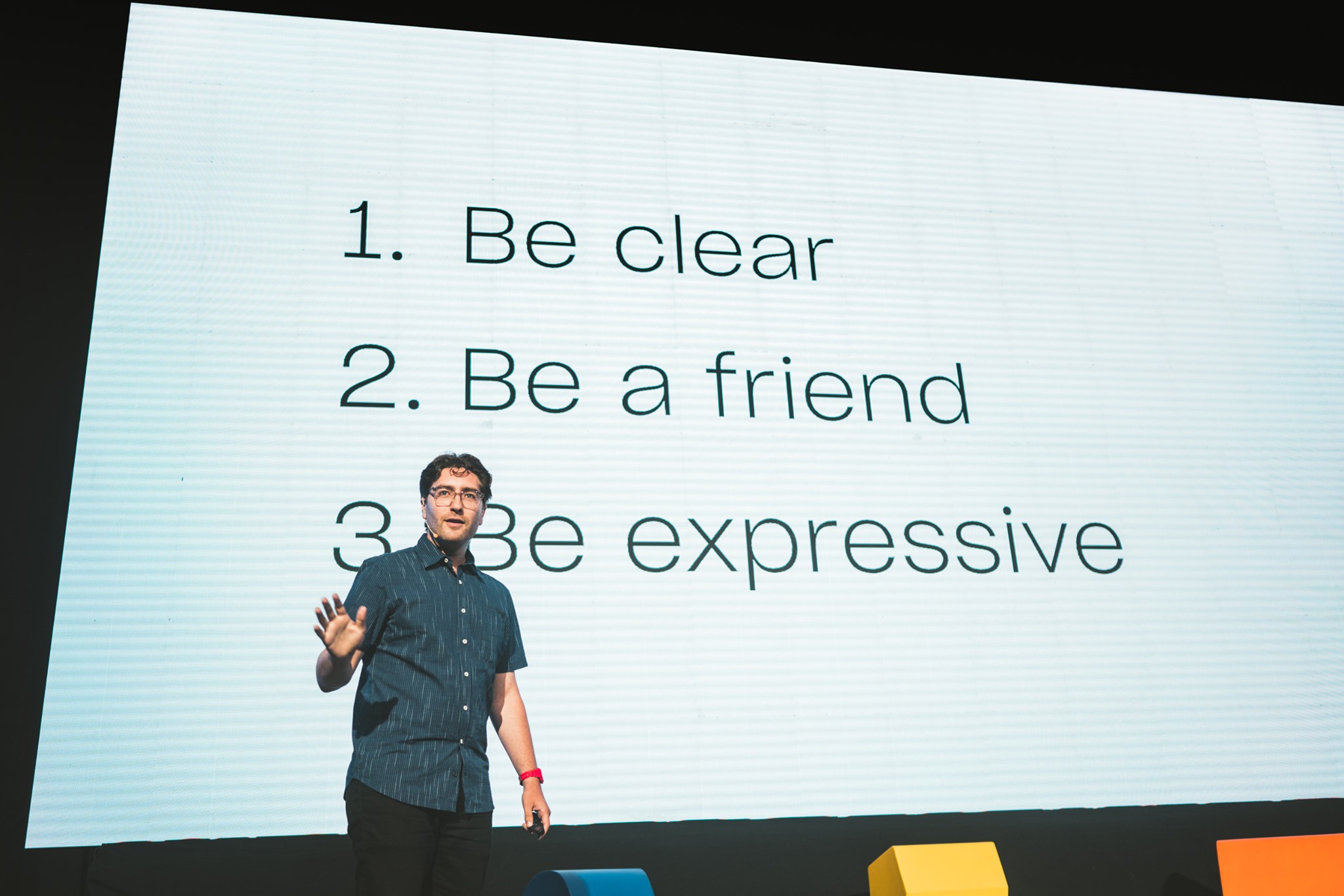
Benjamin Hersh - Photo from UX+
To help creatives design better with words, he shared these simple guiding principles:
1. Be clear
Aside from simplicity, clarity is critical. It makes it easier to get your message across.
2. Be a friend
Be as friendly as possible but still respect the brand’s tone and voice. Don't say things you wouldn't say in real life.
3. Be expressive
Be as creative as you want when providing content—but note that it should be appropriate for the message you are conveying.
A good design should be supported by sound research and solid identity, from the brand’s color scheme to the brand’s tone and voice.
Know your user, and you’ll find a solution.

5. Find your north and stick to it
This was the most memorable part of the conference for me—the North Star metaphor. Just as the actual North Star has been used for navigation, our own North Star would be the guiding light we look to keep focused on our direction or purpose in life—our mission statement.
Eleanor Harding, the product designer for Twitter, shared in her talk how she found her North Star through her career journey. She had several career changes before she realized what she wanted to do.

Eleanor Harding - Photo from UX+
Despite her job hopping, she focused on her goal, her true north, and she used that as an anchor and guide. She kept a positive attitude throughout.
“Tech is built by optimists, because they fundamentally believe that things can and will be better.”
As creatives, getting lost, stuck in second gear, or feeling burnt out is very easy. This is why we need to be reminded of why and what we are doing all this for.
Here at StraightArrow, our North Star is one of the most admired companies serving creative industries worldwide.
We gear towards our true north with our passionate team of great people who consistently deliver exceptionally innovative products and services and actively innovate for our clients.
We’re also committed to helping our clients navigate their paths to their North Star by helping them create customer-centric websites, content, and design and providing them with social media and search engine services.
Book a consultation today to learn more about how we can get to your North Star together.





Comments