What’s in a logo? From its etymology, “logo” is the shortened form of the word “logotype”. Logos is the Greek for “word” or “speech” and túpos, for “mark” or “impression.” Combined, these words take on a new meaning: a mark or an image representing a word or a message.
This year, StraightArrow launches our new company and team logos as part of a rebranding effort to communicate what we stand for in a much clearer way.
Colors - the Vibrance of our Core Values
Colors are vital in establishing a company’s personality. StraightArrow has chosen 4 colors for its new logo: 3 from the old logo - green, gold and white, and a new color - purple.
Green stands for innovation; our work is a result of innovative minds working together - defining the box only to be able to think beyond it, asking why not, defining and redefining creativity.
White stands for light; we are guided by our honesty and integrity. We do the right thing and treasure our Clients’ trust.
Gold stands for our collective value, and the precious talents of every member of the StraightArrow creative process outsourcing team.
Purple stands meaning. Everything we do has meaning. We create for a reason. We always begin with the end in mind.
“Seven” - Perfection
Ninoy Buenaventura, our Chief Creative Director explains the significance of the number 7 plays in our logo design. The most prominent change from the old logo to the new one is in the symbology; we now have the heptagon instead of the folded paper. The 7-sided heptagon is a symbol of perfection and good fortune. From establishing connections with new Clients to nurturing Client relationships, we always strive for perfection.
The “Letters” Say it All
Accompanying the symbol are the words “straightarrow” and “CREATE FOR THE WORLD”. These words summarize who we are. The small letters we use for our name reflect our youthfulness as well as our awareness that we are a very small part of the creative universe. On the other hand, the capital letters we used for our tagline-mission emphasize our reason for being. We are serious, dependable, and dedicated providers of creative services supporting Clients all over the world.
Gems Communicating Brilliance
Aside from our new company logo, Ninoy has also designed individual logos for our teams, with crystal gems serving as his inspiration. We have many wonderful teams: Creative Design, Creative Technology, Business Development, Marketing Services & Special Projects, Market Research & Analytics, Human Resources, Accounting & Finance and our newest team, A.S.S.E.T. (App Development, Software Solutions, and E-Commerce Technologies).
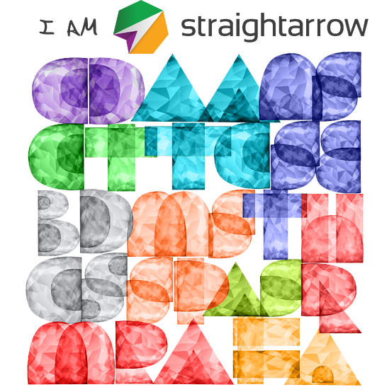
Every member of these teams are like crystals. When they bond with other crystals of the same type, they form a team that shines brilliantly when polished. As seen in the design, the teams embody the perfect cut and brilliance - the real gems of StraightArrow Corporation.
Experience the StraightArrow culture! Let us create something for you today. Contact us to know more about our services and processes. Let’s create for the world together!




Comments