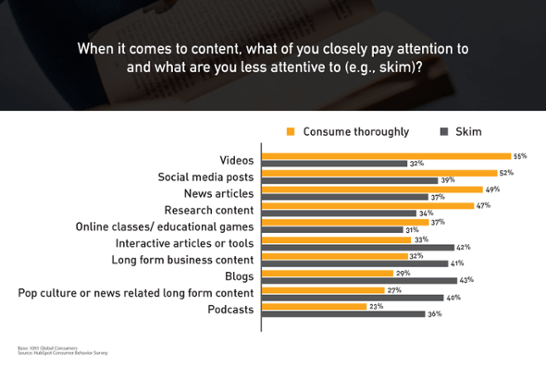
A lot of social commentary these days argues that people these days have shorter attention spans. The results of HubSpot’s Consumer Behaviour Survey for Q1 2016 seem to agree: when asked to describe their content consumption habits, respondents only cited two forms out of ten that they “consume thoroughly” (i.e. read, watch, or listen from start to finish) as a habit.
Written forms have been hit especially hard. Blogs, long-form business content, and long-form pop culture content are read fully only 29%, 32%, and 27% of the time, respectively. News articles, at 49% thorough consumption, are the only written content bucking the trend.
Thus writers must face the question: when people are reading less, how do you get them to read your blogs?

So long, long-form?
Know Your (Non-)Readers
The first step to getting people to read is understanding their reading or non-reading habits. It might be tempting to simply blame it on a lack of patience, comprehension, or appreciation for quality, but there’s more to modern readers than that.
These days, readers are faced with an overabundance of information—much of which is irrelevant or unreliable. To cope with this, they must be able to filter out what matters from what doesn’t with little more than a glance. Therefore, the less they have to go through to find what they want, the better.
The contemporary reader, who finds success in getting more out of reading less, is the skimmer. And the trick to get skimmers to keep reading your blogs is in meeting their habits—you need to write in such a way that gets them to read just enough to realize you have what they’re looking for.
Here are a few tips to do that:
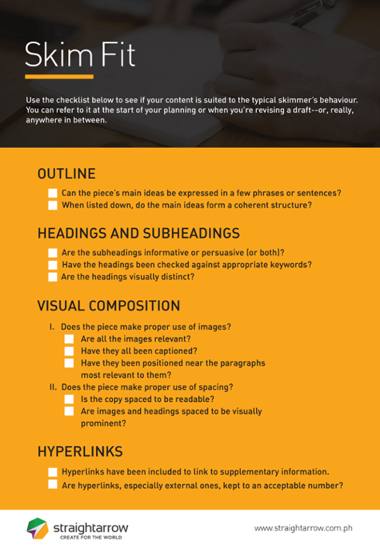
Start with an Outline
An outline serves as the first test of what you’re writing. If you can’t break it down into its main ideas and supporting arguments, then your audience won’t be able to either.
Besides, these main ideas are precisely what skimmers look for on their first pass. If you put them into words right from the start, you’re that much closer to drawing them in.
Using keywords is a great way to phrase the ideas in your outline. The closer your writing is to the phrases people use to ask questions, the more likely they are to give your piece a second glance.
Structure with Headings and Subheadings
You can get further mileage out of your outline by using its main ideas to structure your final piece. Headings and subheadings break an article down into easily identifiable chunks. If there are any specific subtopics your readers are looking for, they’ll be able to find them easily.
Your headings should be visually distinct. Increasing their size, changing the typeface, emboldening, or any combination of those are some common ways headings are set apart.
These distinctions serve two purposes: 1) it makes it more likely that readers see them first, so they can figure out the main points right away; and 2) if used with multiple levels (i.e. headings with subheadings under them), the differences in visual distinction allow the readers to organise the information in relation to each other using just visual cues.
Finally, the use of headings and subheadings takes nothing away from the final piece. Readers who want to go through it from start to end can do so without any loss in content or quality. After all, while you’re writing for skimmers, you shouldn’t compromise the experience of your thorough readers.
Visual Composition: Images and Spacing
Visual presentation may be mostly a designer’s job, but as a writer, you should spare a thought to what your piece will look like. After all, your audience will engage with it visually.

You have two major techniques in dealing with this: images and spacing.
Images
Images, like headings, draw attention to themselves. As such, they’re a good way to anchor major ideas or supplement arguments. Photographs or illustrations can convey a scene in a single glance, while charts and graphs make data easier to read.
Most images, however, are open to interpretation, so it’s important to provide context through captions. In a similar way, charts and graphs should always be properly labeled.
Another way to provide context is through positioning. For instance, an image that provokes curiosity might be situated before a paragraph related to it. Conversely, an image that provides clarification on an idea raised in the piece should follow the paragraph that introduces that idea.
Finally, avoid using images simply for ornamentation or for racking up hits. Images within a piece should fit in with the rest of the contents. Omit irrelevant images as you would with redundant lines. Anything unnecessary, after all, is a distraction.
Spacing
Absolutely everything you publish will have spaces in it, so you may as well use them to your advantage. Subtle as it is, managing the absence of visual elements in your piece can provide you with readability, emphasis, and structure.
The use of spacing is carried out mainly by defining how far any element is from another. This could be on the level of individual letters, between words and images, or between different sections. Sufficient space between letters, for example, may improve readability, while increased space around an image can make it more prominent.
As a general rule, the more empty space an object, whether text or image, has around it, the more prominent it becomes. Conversely, however, elements can also be placed unconventionally close to each other to create a jarring effect, which also attracts attention.
Establishing hard and fast rules with space is difficult, so experiment with it when you can. Much of spacing depends on exploiting expectations: either fulfilling them, or defying them.
Hyperlinks
Everything on the web is both a destination and a path to another destination—and this is embodied by hyperlinks. With the use of links, a single word can serve as the gateway to an entire encyclopedia. Use them effectively, and you can connect readers with a lot of information with just a few words.
The more such links you establish, the more likely it is your audience will find what they’re looking for on one of your pages—though it might them a link or two to reach it.
Linking to internal pages is ideal, as it gives you more traffic, but is limited by the content you’ve already produced. External links might not give you an SEO boost, but if they help satisfy your readers, those readers are more likely to come back.
The way hyperlinks bridge content makes each piece part of a larger body of information. The things you write should take this into account: what can each entry link to? What topics, past or present, can link back to it?
Such a strategy lends itself to a collection of entries with different lengths. An archive of only tightly-focused pieces will find few areas where their topics overlap; an archive of only deep, topic-spanning pieces will have pieces too broad to serve as supplements to each other.
Bridging Disciplines
It should be clear by now that while you, as a writer, should take an active role in optimising your pieces for skimming, the expertise of other specialists can improve it a great deal. Graphic designers have the best idea of how to curate or create images and manage space; SEO specialists will know what keywords work best as headings and subheadings. Take a lesson from the character of the web—fragmented but linked—and improve your content by taking the best of what all marketing specialisations have to offer.
Keep yourself at the forefront of the quickly developing realm of digital marketing: download the 2016 State of Inbound report.


Comments