9 Ways to Create a Powerful Brand Aesthetic on Instagram

Here’s an open secret—people are attracted to a well-managed brand aesthetic. But some content creators and curators fail to realize that there is such a thing as being too visual. But, how can businesses create a powerful brand aesthetic on Instagram?
Established brands make mistakes. Some of those result in losing the message they want to convey to their market.
Remember: aesthetics are more than just your logo.
Your brand’s overall look and feel should also consider the image and reputation that your consumers choose to attribute to your business, especially on Instagram.
These can dramatically influence how your market views your company.

credits: Slaying Social
In today’s world, social selling can make or break your business. Discovering the perfect Instagram aesthetic can be challenging. Still, once you unearth the right strategy for creating consistently beautiful photos and a well-curated and cohesive look for your feed, these aesthetics will help your brand following grow and engage better with the right audience.
When talking about social media platforms like Instagram, and Instagram aesthetic refers to the look and feel of a feed. It's the underlying principle and leading guide to all your digital branding.
Since Instagram has proven itself to be a powerful platform for brands to market themselves, your feed must reflect who your brand is and effectively communicates your message to your audience.
A cohesive aesthetic helps your posts stand out on your followers’ feeds against hundreds of other accounts.
We cannot stress the importance of social media, especially its role in the overall growth of businesses and brands. The onset and growth of social media channels—especially Instagram—have stood the test of time by satisfying audiences’ thirst for instant fulfillment.
But what exactly is your market looking for when scrolling through their feed? Out of the millions of posts uploaded minute-by-minute, what makes them stop to take a second look?
Instagram is all about your brand's creative representation and engagement with your audience.
It's for sharing appealing visual content to increase post reach and draw in users to interact with your brand.
Your brand can choose from a wide variety of ideas, making the process of creating, sharing, and selecting content quite challenging. All you need to do is scroll through your discovery page, and you’ll see a wealth of images and videos.
But before you start planning your posts, you need to know why you're posting in the first place.
- Is your goal engagement?
- Is it visual communication?
- Or are you simply hoping for a trend bandwagon because every other brand is doing it?
Instagram handlers face a big problem with the pressure to "just post something." But releasing content for the sake of just releasing is the wrong approach. Believe it or not, your market can sense mediocre work. They can tell when your content is dull and your monotonous captions.
Curating and creating on Instagram takes time and dedication as you need to share well-thought-out posts with a cohesive visual media style. But before you even start thinking of content to post, you first need to establish your brand’s personality and identity.
Here are five steps to start:
Establish Your Brand Personality
It’s best to start with determining your brand personality so that you can begin developing solid content for the platform.
Here are suggested factors to help you with your brand personality:
- Specify a persona that defines your core audience and how they would use your products and services.
- Probe for helpful stats by looking into Instagram influencers that relate to your target persona.
- Decide which photos and videos you want to share for the consideration of your market. Strategically determine what fits and what doesn’t.
- Be creative and add flair, but remember to remain informative through captions and hashtags.
Select Your Theme
These days, brands develop themes that match a look and feel to make them memorable.
Choosing a theme is a crucial detail that pays dividends in the long run.

credits: New Lune
Choose a Filter
We’ve learned from statistics that it’s best to pick a filter and stick with it.
According to them, around 60% of top known brands on Instagram use the same filter for each post.

Decide on a Grid Layout
An Instagram grid layout helps you think about the overall look of your feed based on the individual squares of photos shared.
This also helps to organize a cohesive look and feel, serving as a guide when you need to decide on which photo to post next.
credits: Bloguettes
Create a Story
Curating your brand’s aesthetic shouldn’t be limited to feed posts. Tying a narrative to your brand identity creates an emotional connection between you and your market and delivers real meaning to your content.
Now that you know the five main points in establishing a brand’s personality and identity, let’s discuss and determine what is needed to achieve your brand’s Instaesthetic.
Color Palette Inspiration

credits: Dexigner
Instagram marketing aims to reach your audience's same level through communication and inspiring real engagement.
To get your market to click the “follow” button, you’ll need to catch their attention—without creating a jumbled mess on a brilliant-looking photo.
To be clear:
A color palette does not match everything on your feed but gives your audience something to expect. And while consistency is subject to preference, if it can work for your brand’s feed, then run with it.
Make sure to review your brand’s purpose and be mindful of posts that may be off-putting or confusing.
Here are some things to consider when it comes to your brand’s Instagram color palette:
 |
 |
 |
credits: Sked Social
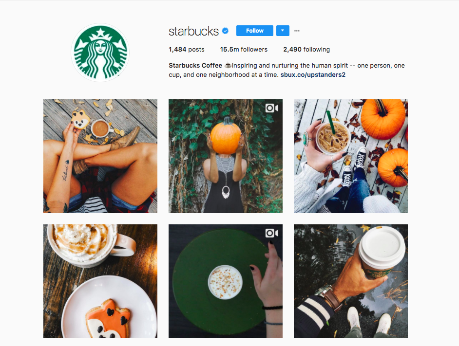
1. Analogous color palettes are those with colors that are next to each other and give off that warm and relaxed look. Starbucks during the autumn season showcases a warm analogous themed feed.
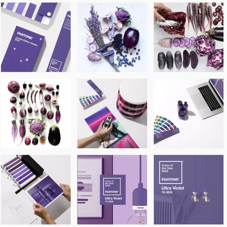
2. Monochromatic color palettes are perfect for brands strongly associated with a single color. This gives your brand the option to expand the meaning of that single color by adding tones to your feed.
3. Complementary color palettes feel a little more creative because of the disparate colors.
4. Neutral color palettes are not exactly considered a “type” of palette, but they perform very well on the platform. Neutral colors allow that “pop” factor that brings invariable color elements to your feed.
As you can see, consistency does matter. That said, it also shouldn’t limit you from being creative.
Learn to switch things up by allowing one of your colors to take the spotlight occasionally.
One example of a brand that has learned color spotlight consistency is Fossil—for every nine to twelve images, they allow a new color to stand in the spotlight.
This alternative could enhance your channel if color-theme choosing is challenging for your brand, but do consider that switching colors does not equate to switching your style.
Consistency should still be critical to your composition.
Filters vs. No Filters for Brand Aesthetic
As brand and business owners, you’ll encounter numerous arguments on whether placing filters on your posts and stories is good for you. But it’s worth noting that filters are like an outfit that can make or break your brand’s feed.
Choosing the right filter gives off a cohesive look; choosing the wrong one leaves you with a messy brand feed.
Remember that you want to leave two things to your customers:
- A presentable feed
- An excellent FIRST impression.
There’s also no harm in visiting other Instagram accounts for inspiration. And if you can’t find Instagram accounts that have themes that appeal to you, you can always try searching filters via the Preview App, which offers the option to customize, design, and schedule your posts for your Instagram feed.
Overall, it’s essential to stick to one filter because it’s the easiest way to create your theme and make your feed look more cohesive.
Add Quote Images

credit: Sked Social
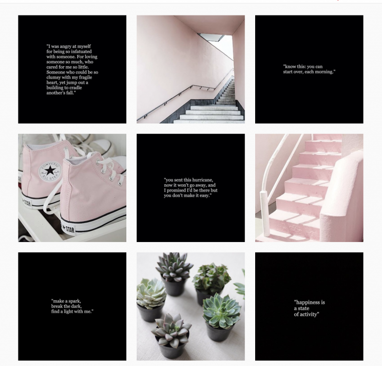
No one can deny that beautifully photographed product shots can be eye-catching, but too much can make your feed too busy.
Adding quote images is excellent for creating negative space between posts. It's also a way to hack extending your brand palette.
- Consider using a white background with black text to offset colorful graphics. This is a great trick to ensure that your graphics don’t compete with the colors in your photo.
- Feel free to get creative by doing the reverse and using a dark background with white text.
Aesthetically Captivating Stories
Now that you’ve created a beautifully curated feed, it’s time to level up on more captivating ways to engage with your market without losing your brand’s aesthetic on the platform.
When leveraging your audience and showcasing your brand, the best place to do this is through Instagram Stories.
Creating a strong Instagram story strategy becomes more than just being creative and engaging, making it easier for your audience to fall in love with your products or services.
Learn how to design stories that match your brand’s aesthetic, captivate your audience, and eventually turn your visitors into followers.
If you’re a small brand with little to no prior knowledge, it's always good to check out apps like Over that offer pre-designed templates that you can match with your aesthetic through your phone.
Here are a few tips for customizing templates, which can apply to both big and small brands and businesses:
Tip #1: Be Consistent
Getting creative for engagement purposes can be tempting, but using different templates could compromise your branding and impact how your market recognizes your posts.
Stay consistent with the style of your Instagram Story templates.
Tip #2: Play Around with Typography
An easy way to scale up the designs for your custom story templates would be to use your official brand fonts and incorporate others that complement them.
Here are some tips you might like to consider when picking out fonts:
- Pair handwritten fonts with bold angular fonts.
- Pair san-serif fonts with serif fonts.
- Pair chunky sans-serif fonts with light serif fonts.
Tip #3: Look for Stock Images
Regarding Instagram Stories, images are one of the most important things to consider.
A good hack when trying to find the correct stock photo to establish a certain feel or style is to search by theme rather than looking for the exact image you need.

credits: Twenty20
Tip #4: Get Animated!
A big trend in the design community is adding animated videos to your stories.
For one, it adds that instant wow factor—and many media libraries out there offer graphics and animation for customized templates.

credits: Mcdonald's Singapore
Tip #5: Incorporate your color palette into your Stories.
As mentioned earlier, color palettes play a significant role in the overall aesthetic of your Instagram branding.
Sticking to your palette is one key to building brand recall.

credits: Colorlib
Takeaway
Now that we’ve listed all the things to help you deliver an aesthetically pleasing feed, it should be easier for you to turn your visitors into followers and potential customers.
Remember: an excellent curated Instagram aesthetic strategy starts with the right strategy.
Everything else will follow through when you apply the right tactics and tools.
Ready to get started with creating a cohesive and curated Instagram feed?
We’d be more than happy to join you on this journey.
Let us help you discover your brand’s Instagram aesthetic with our Social Media Packages.
Originally posted by Nic David on June 11, 2019. Updated by Llana Robles on July 27, 2022.


Comments