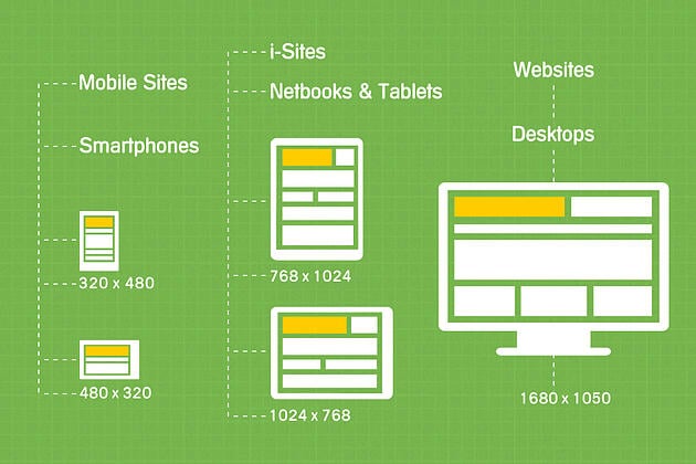
Quick question: Where are you reading this blog post? Are you using your laptop at home or your desktop in the office? Maybe you’re reading this on your smartphone or tablet at a café or in the car.
Pete Cashmore of Mashable predicted 2013 to be the year of responsive web design. While majority of websites have yet to go responsive, businesses and designers are beginning to understand the need for it.

Internet research firm Pew reports that, as of the first quarter of 2013, 34% of adults in the US own a tablet computer. Meanwhile, market research firm Nielsen surveyed that 61% of US mobile subscribers have smartphones. A 2012 Google study also says that 98% of Internet users in the US use both devices interchangeably every day.
More so, according to Nielsen, 84% of tablet and smartphone owners say they now use their gadgets for shopping and business-related activities.
This means companies have to improve online shopping for consumers, making it easy for them to find store locations, view product galleries, and actually purchase products whether they’re on a desktop, laptop, tablet, or smartphone.
Because of this, web designers also need to evolve from just creating static web pages in standard sizes and resolutions. Chen Ramos, StraightArrow's former assistant team leader for web and application development, notes that the responsive web design (RWD) process involves using fluid grids to change the site’s aspects according to different display monitor sizes. It also involves additional steps like testing a site on a variety of gadgets and adjusting the different aspects of a site accordingly.
To better understand responsive web design, let’s look at the basic aspects of a website and how these need to adapt to the screens of hand-held devices:
1. Images: In responsive web design, images should (1) be able to change sizes - and even disappear - depending on the device, (2) be very clear, and (3) load fast. These three requirements are important to give Internet users the same online experience no matter where they are in the world or what bandwidth speed they have. Web designers need to fix the data in the images to meet these requirements.
2. Layouts: How many pages does your website have? Whether it's 10 or 100, it is impractical for a responsive web designer to change the layout page by page to suit different devices. Developer John Polaceck recommends that designers start with the smallest devices when thinking of layouts. Thankfully, there are flexible layout models that can help designers do this more efficiently.

3. Menus, tables, buttons and forms: Businesses can make the most of their websites by letting users move from page to page, choose from menus, and fill out forms—and these should all work well on all types of gadgets. But because display screen sizes vary, web designers first need to find out which information, blank fields, or buttons are the most essential and should be available across all devices.
4. Embedded content: Some websites include embedded content like Youtube videos or Google maps. A responsive web site should allow these types of content to function properly on handheld devices. They can be entertaining and may provide useful information about products, promos, or events.
Having a responsive design format for your websites says at least 2 good things about you: 1) that you are up-to-date with technology, and 2) that you understand the importance of a good customer experience.
Click here to view how your website looks like on different screens. Now access StraightArrow’s website, straightarrow.com.ph, on your mobile phone or tablet, and you’ll see a good example of a responsive website.
One size simply doesn’t fit all. So, your website should be developed with the goal of offering the same online experience to people whatever gadget they’re on and wherever they are in the world. Click here to get a non-committment website redesign quote today!
About the Author
Xenia-Chloe H. Villanueva is a Communications Specialist at
StraightArrow Corporation. When not writing copy or developing concepts, she reviews movies for a Webbie-award nominated blog. She also jogs, cooks and contributes to independent poetry projects.
References:
Zickuhr, Katryn. "Tablet Ownership 2013." 10 June 2013. Pew Internet & American Life Project. 9 July 2013.
Nielsen. The Nielsen Company, 2013. Web. 9 July 2013.
Cashmore, Pete. "Why 2013 Is the Year of Responsive Web Design." 12 Dec. 2012. Mashable. 8 July 2013.
Hockenson, Lauren. "29 new inspiring responsive designs on the web." 13 Jan 2013. The Next Web. 8 July 2013.
Poleck, John. "What the Heck is Responsive Web Design?" n.d. Web. 8 July 2013.
Walter, Stephanie. "The State of Responsive Web Design." 29 May 2013. Smashing Magazine. 8 July 2013.
Rinaldi, Brian. "Getting Started With Responsive Web Design." Feb 2013. Adobe.com. 8 July 2013.
Petit, Nick. "Beginner's Guide to Responsive Web Design." 8 Aug. 2012. Treehouse Blog, Treehouse Island Inc. 8 July 2013.
"The New Multi-Screen World Study." Google, Aug 2012.Web. 12 July 2013.
Do you like our blog? Get fresh new entries right on your email!

Comments