
The one constant in life is change. For a marketing agency to stay ahead in the branding game, change shouldn’t just be acknowledged — it needs to be embraced.
Initially launched as a full-service integrated creative advertising agency back in 2001, AMBA possesses a wealth of experience in adapting to the ever-evolving needs of the market. As one of Australia’s most innovative advertising and marketing communications agencies, change is deeply ingrained in AMBA’s processes and culture. This is perhaps most evident in the way the agency redefined its approach to marketing; from initially focusing on a Multiplied Impact Strategy (which they define as “producing immediate results while building long-term value”), AMBA now combines Inbound, Smarketing, Fascination, and other game-changing concepts that the brand has adapted over the past 15 years to create a unique marketing formula that is both efficient and truly effective.
The Problem
AMBA had one problem: while their brand’s identity and approach to marketing evolved and kept up with the times, their website didn’t. The design of their website, while simple and straightforward, was a little too conventional for a company as dynamic as AMBA. It was almost like a customised version of a common website theme, safe and normal — not at all like the personality of the brand it represents. And with the help of analytic data, AMBA realized that the way their website was designed could very well be the single biggest reason why they had not been as successful as they had wanted in converting their website traffic into leads.
In 2015, AMBA decided to turn their website into one that showed the world who they are. They needed a website that did justice to their brand - a website that showed their expertise and their concern for clients and a personality that is best captured with a rainbow of colors and designs that hold their own individually, yet still come together beautifully; a unique combination of text and images that was both trendy and direct to the point. In other words, they didn’t just want a website for AMBA; they wanted AMBA: The Website.
The Solution
Fortunately, AMBA had the perfect partner for this mission - StraightArrow.
StraightArrow was certainly no stranger to AMBA’s unique branding. We had worked with them on an earlier (albeit minor) website redesign project, which had more to do with updating small page elements than actually redesigning the website.
This time, AMBA had a clear idea of how they wanted their website to look: clean and minimalist. Powerful, vibrant, and modern. Trendy and smart.
Following AMBA’s branding guidelines, we set out to accomplish the task at hand. In keeping with current website trends, we used full-screen, one-fold banners for the website. We also toned down the gradients on the website, choosing to emphasize AMBA’s individual colors instead.

A sizable amount of AMBA’s content had to be reduced, which meant a fair bit of content re-organizing to make sure that each page ended up being straightforward and laser-focused.
We also incorporated more white spaces into the overall design, so visitors eyes are drawn to the most important elements of the website. Throughout the website redesign process, we consulted with our IM specialists and made sure that everything we did appealed to AMBA's buyer personas.
The Results
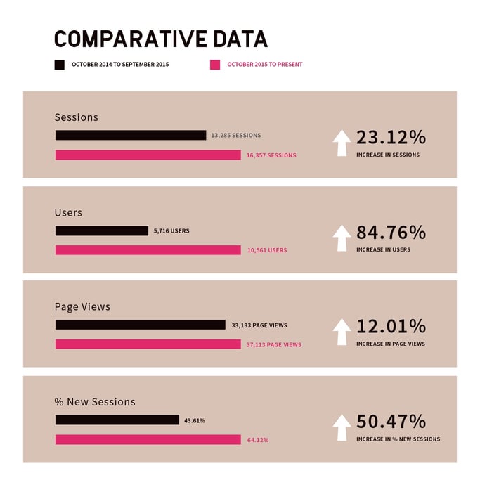
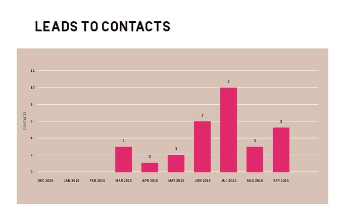
AMBA was very happy with their new website. We delivered what was scoped and because AMBA had a deep knowledge and appreciation of their buyer personas, the latter noticed, stopped and engaged.
StraightArrow is a HubSpot Platinum partner focused in supporting HubSpot agencies, like AMBA. Our best relationships are strategic partnerships with Hubspot agencies that are strong strategists. We provide the creative muscle for executing marketing campaigns and successfully completing creative projects. Drop us a line — let’s find out how we can delight your clients together.




Comments