The best landing pages are considered the best because they achieve one thing: converting visitors into leads. If they can manage that well, they need do nothing else. The flipside, of course, is that a landing page that’s not getting conversions is just digital dead weight.
Since dead weight’s no good for any website, the question follows: how do you make a landing page that converts with single-minded efficiency? Stripped to its basics, a landing page pits the value of an offer against the cost of a form, hinged on a CTA—will they click it or not? A landing page’s contents should be everything that tips the scales in favor of “getting that click”; not a word or image more.
The Three Main Elements
There are three main elements in a landing page: an offer, a form, and a CTA. Everything else about a landing page has to do with emphasizing, supporting, or expanding on one or more of those three.
You want your offer to appear appealing and credible; you want your form to be quick and straightforward; and you want your CTA to be clear and compelling. In this way, people will judge your offer worth the cost of the form, enter their information, and click your CTA.
Everything that goes into your landing page—copy, images, layout—should contribute to that aim as effectively as possible. Anything that is irrelevant, distracting, or even just inefficient at that task should be left out.
Before going into the finer details, it bears mentioning that what goes into a landing page depends on where that page fits in your larger marketing or digital strategy. For instance, users who access a landing page from a blog link would have more information to go on than users who access it from a social media ad. When deciding what content to keep or to cut, take note of where your visitors will be coming from.
Content That Makes the Cut
The content on a landing page focuses mainly on making your offer appear appealing and credible. There should be no more than absolutely necessary, and the most important bits should come first.
Writing for landing pages is like newswriting, in the sense that it follows an inverse pyramid. It starts with a clear headline—which should be about your offer—and lists information in decreasing importance. As such, your landing page copy might take the following order: headline, benefits, social proof, and then any other points necessary for credibility. Let’s break that down:
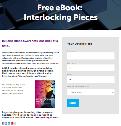
The headline should clearly explain what your offer is about. Avoid vagueness and jargon here. A simple phrase, like “Free eBook: [Topic]” makes for a solid headline.
After the headline, you can spend a few words to describe the offer further. As much as possible, this description should focus on the benefits visitors can get out of the offer — the subject matter of an eBook or the contents of a downloadable package, for instance.
Once your visitors know what the offer is, what remains is to convince them of the credibility of the offer’s provider: your company, in other words. There are different ways of doing this, including testimonials and statistics, and the mix of proof you provide should cater to your target customer.
Other assurances may be in order as well, such as a privacy policy to guarantee their information will not be used illicitly. These assurances should be worded discreetly, though; avoid words with negative connotations, such as “spam,” as these have been shown to lower conversion rates.
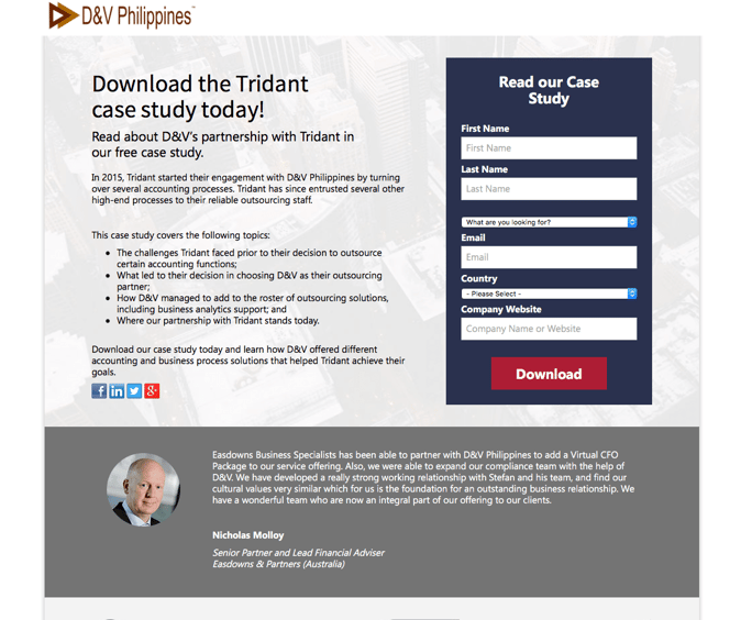
Take for example this landing page for a case study. A simple headline announces the offer and is followed by a brief description that sets the stage for the list of benefits. To provide credibility, there’s a detailed testimonial, as well as a list of logos of other satisfied clients. The content covers all bases without going on for too long.

This page has achieved a views-submission ratio of 31.25%. Other common indicators for landing page success include traffic, bounce rate, and cost-per-lead.
When refining the content in your landing page, having it arranged according to importance makes it easier to lay out. The most important information receives preferential formatting— standout font, placement above the fold, etc.—while less important copy can be placed in smaller font below the fold, or cut entirely.
Landing Page Layout
As mentioned, a landing page’s graphic elements should focus on emphasizing the things that will get much-desired conversions. Landing page design focuses on highlighting the offer and showing the visitor how to take action. It distinguishes important bits of copy, emphasizes the form field and CTA buttons, and reduces anything that might distract from these.
In the landing page below, which we built for one of our clients, you can see the visual elements at work in supporting the page’s main aspects:
- The offer is explained clearly in a headline and short description. The copy’s importance is reflected in the font assigned to it.
- The form consists of only four fields, but these are allotted sufficient space and accentuated by icons.
- The CTA button is marked by a distinguishing color and clearly tells users what to do to proceed.

The overall visual character of a landing page should, of course, be appealing. It should also maintain continuity with whatever directed the user to the landing page, whether that was a CTA on your company’s website or an ad in search or social media. This serves to both keep your message consistent and further establish your credibility. Users will trust a page that meets what they expected when they clicked.
Ultimately, landing page design is about unity—all the elements come together to fulfill a single purpose, which is conversion. But getting that conversion means streamlining the user’s experience from the moment they click the link to your landing page: making sure their goal, the offer, is clear, as is the way to get to it.
For more in-depth discussions on conversion, marketing strategies, and web page design, feel free to reach out to us.


Comments